Designing for culture, community, and connection
Designing a more intentional, inclusive planning experience for first-year grad students navigating new campuses, communities, and calendars.
Designing a more intentional, inclusive planning experience for first-year grad students navigating new campuses, communities, and calendars.
Role / UX Designer & Researcher working with three peers.
Timeline / 4 months
Tools / Figma, Miro, Google Workspace, Notion, Adobe Illustrator
Timeline / 4 months
Tools / Figma, Miro, Google Workspace, Notion, Adobe Illustrator

You know those moments where you want to reach out and hang out with someone, but you hesitate? Not because you don’t care, but because life is full, your calendar is blurry, and your emotional energy is low?
That’s where this project began.
As a first-year grad student new to campus and country, I noticed something: even when people wanted to connect, they often didn’t. Plans got postponed, group chats went silent, and “we should meet sometime” floated around with no real weight.So our team asked / What makes planning feel emotionally heavy and how might design lighten the load without demanding more from already-stretched students?

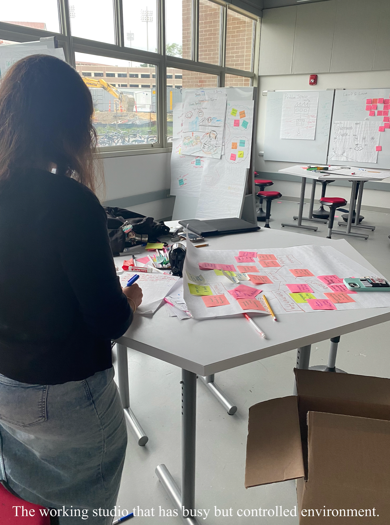
Research & Discovery
/ Feeling left out of your own plans.
When I started grad school, I thought building community would come naturally. Instead, I found myself hesitating, even for things I wanted to do. I wasn’t alone.
Through interviews with fellow first-year students, we learned that “just making a plan” wasn’t simple at all. Students wanted connection, but didn’t know how to initiate it without pressure, awkwardness, or emotional fatigue.
What we did / Contextual interviews with 8 students, Timeline & emotion mapping of social planning behavior, & Literature review on decision fatigue and social energy.


Persona Needs /
Organized Planner - Prefers structured event planning with RSVP tracking,
Spontaneous Connector - Wants to meet friends on the go without pre-planning,
Cultural Connector - Looks for events catering to specific cultural backgrounds.

What we found /
Planning is emotional labor,
No one wants to be the initiator - but everyone wants to be invited,
Social tools assume control. Our users lived in ‘maybe’.
“I want to hang out with someone… I just can’t bring myself to start the plan.”
Ideation & Concept
/ Designing for the emotional middle ground.
We weren’t trying to make a better calendar. We were trying to build something gentler, a space where someone could say “maybe” and still feel connected.


Early sketches explored everything from emoji-based check-ins to vibe-matching. We found ourselves asking:
What if planning didn’t feel like planning?
What if planning didn’t feel like planning?
Principles we designed around /
Emotional visibility without pressure
Low-effort social “nudges”Culturally inclusive ways to say: “I’m open, but not committed”

Concepts explored /
“I feel like...” mood starter
Semi-public pulses (without real-time tracking)
Shared solo time: study pods, walks, coffee breaks

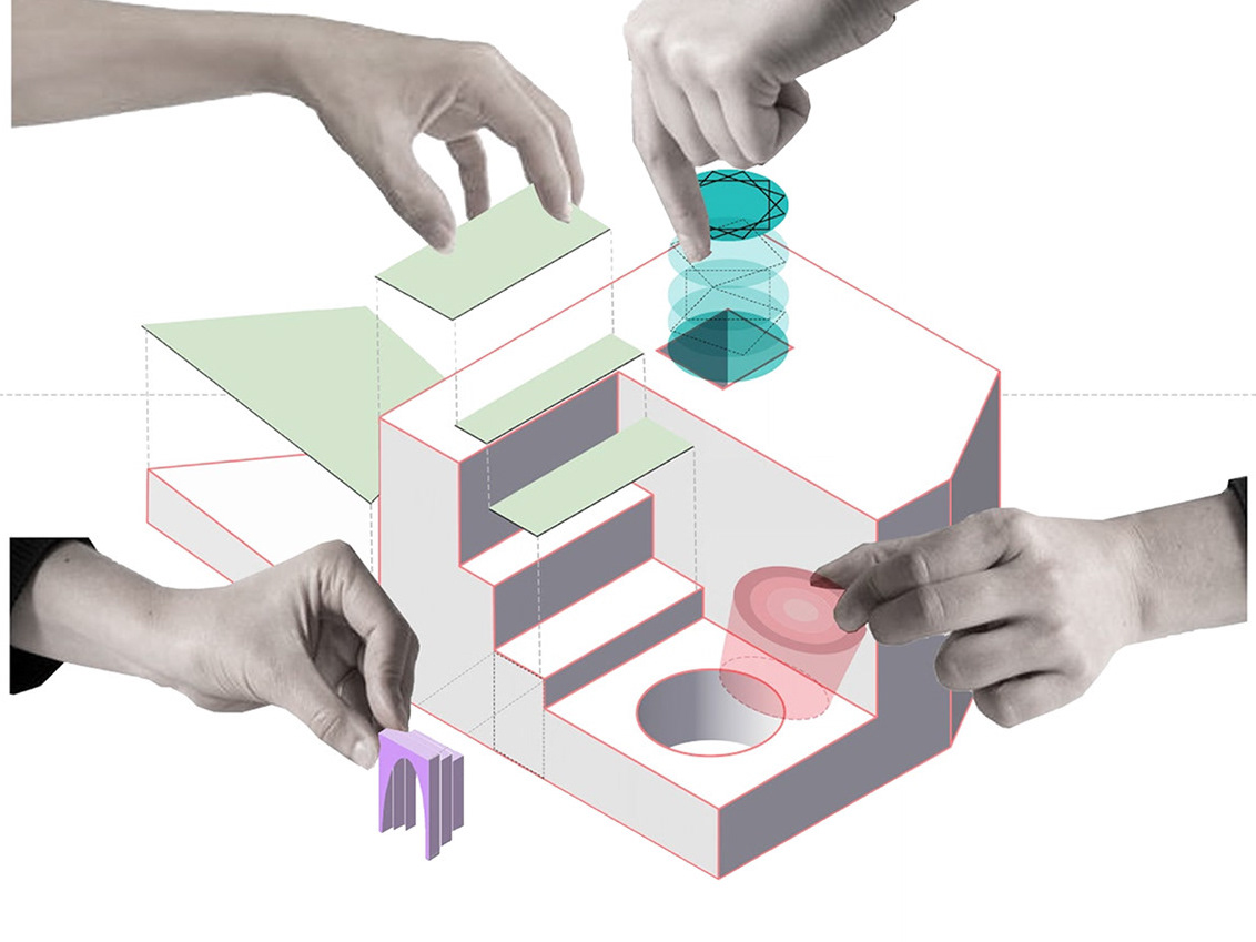
Design Sketches

Story Boards
Final Prototype & Features
/ A softer way to make plans.
Our final design was a lightweight interface that helped students express interest, notice others, and opt in, without pressure or expectation.
Paper Prototype
Key Features - User Journey
Key Features /
“I feel like…” lets users suggest activities without direct invites
Plan pulses show who else might be open nearby
Energy filters for matching social capacity (chatty, mellow, solo-but-not-alone)
Gentle opt-ins for confirmed plans

"Sometimes all we need is an opening, not a commitment."
Prototyping & Usability
/ What we heard when we showed the flow.
We tested with peers and advisors. Many expected something heavier—what they found felt light, respectful, and even “relieving.”
What worked /
Frictionless entry into planning
Emotional resonance with interface language
Clarity without pressure
What we changed /
Made “pulses” clearer (not location tracking!)
Simplified commitment flow from two taps to one
Removed calendar view entirely—no schedules, just signals
Impact & Learnings
/ This wasn’t a planning tool. It was a care system.
This project changed how I think about design. I used to think UX was about solving friction. Now I see it’s also about making room for human contradiction, emotional timing, and gentle invitations.
Takeaways /
Design can reduce emotional overhead, not just cognitive load
Social UX needs empathy more than features
Sometimes connection is a whisper, not a push notification

Project Display at BOOM '25 - Cornell (Bowers-CIS)

Team / Sumit Gawali (sbg227@cornell.edu), Aditya Vinodh (av364@cornell.edu), Isha Madhurendra ( im386@cornell.edu), and Peipei Duan (pd439@cornell.edu)