TRIC Robotics Website Redesign
Designing for credibility in a risk-averse industry.
Designing for credibility in a risk-averse industry.
Role / UX Designer – research, synthesis, IA, content strategy, interaction models, and (ongoing) wireframes.
Timeline / 1 month (This is an ongoing redesign process. I’m publishing progress in phases)
Tools / Figma, Miro, Google Workspace, Notion, Adobe Illustrator
Timeline / 1 month (This is an ongoing redesign process. I’m publishing progress in phases)
Tools / Figma, Miro, Google Workspace, Notion, Adobe Illustrator
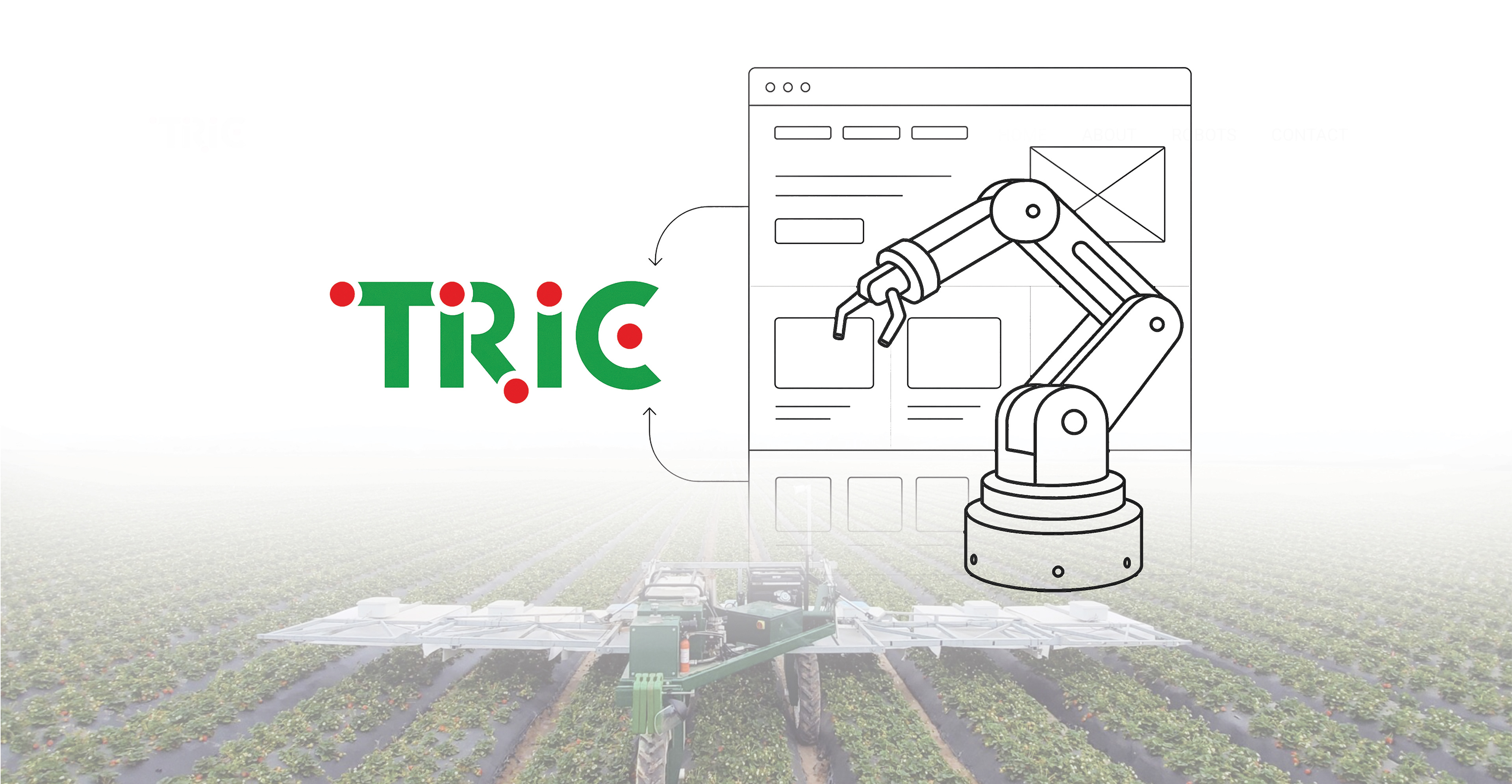
TRIC Robotics builds UV-based robots that operate at night to reduce pesticide dependence in strawberry farming. Their challenge wasn’t the product, it was the website. Farmers, investors, and talent needed clarity and proof. The old site couldn’t deliver that, so we partnered to rethink the experience from the ground up.
Our challenge / TRIC Robotics needed a website that builds credibility and trust with risk-averse farmers while also attracting investors, partners, and talent.
TRIC’s previous website struggled to communicate credibility and clarity. Visitors couldn’t quickly understand who TRIC was, what they offered, or why they should trust them. This created friction for farmers, investors, and talent alike.
We needed to build trust, clarity, and conversion.
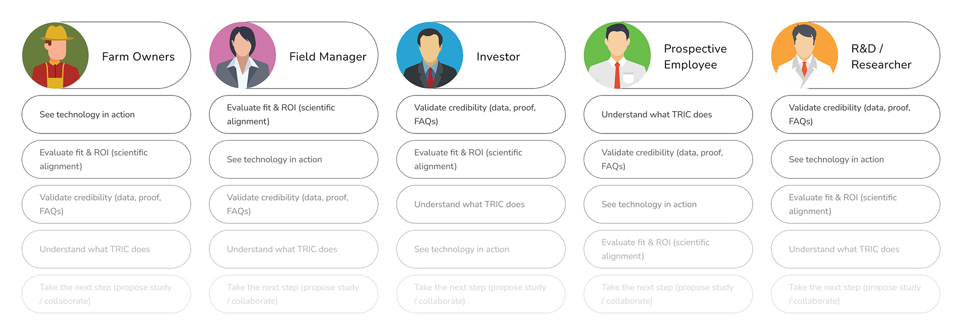
Who we're designing for / When we dug deeper into TRIC’s audiences, it became clear that the website wasn’t serving one group; it had to serve many.
Farmers wanted profitability and reliability. Investors wanted proof of traction. Researchers needed credible data. And potential employees needed to see innovation and culture. To capture these different needs, we mapped out five representative user types. These personas became the backbone of our design decisions.
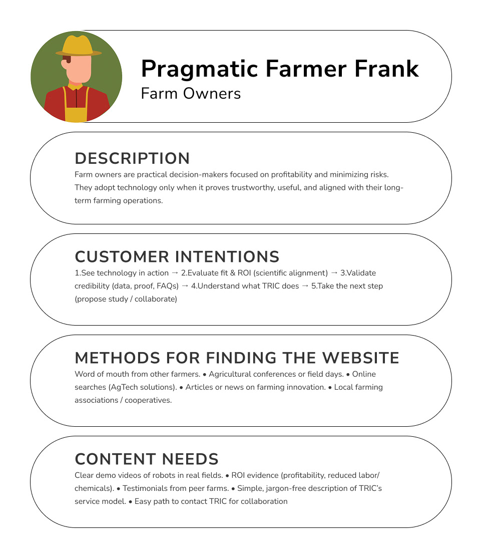
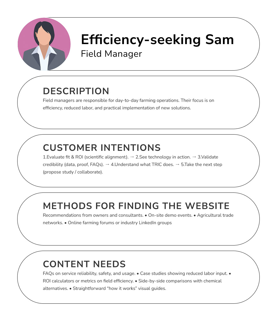
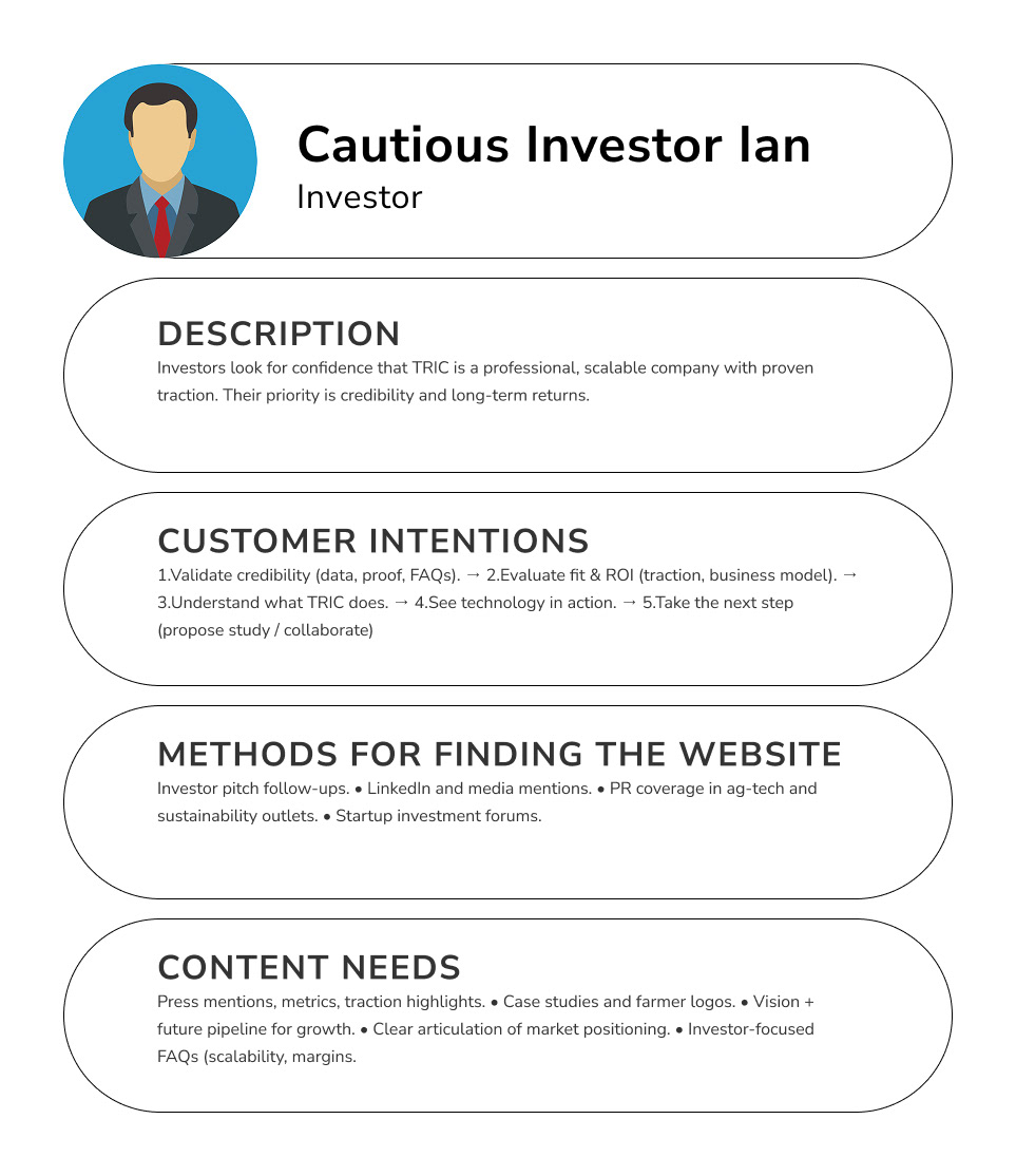
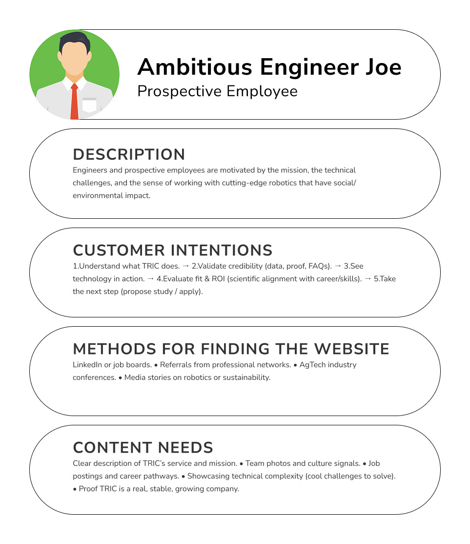
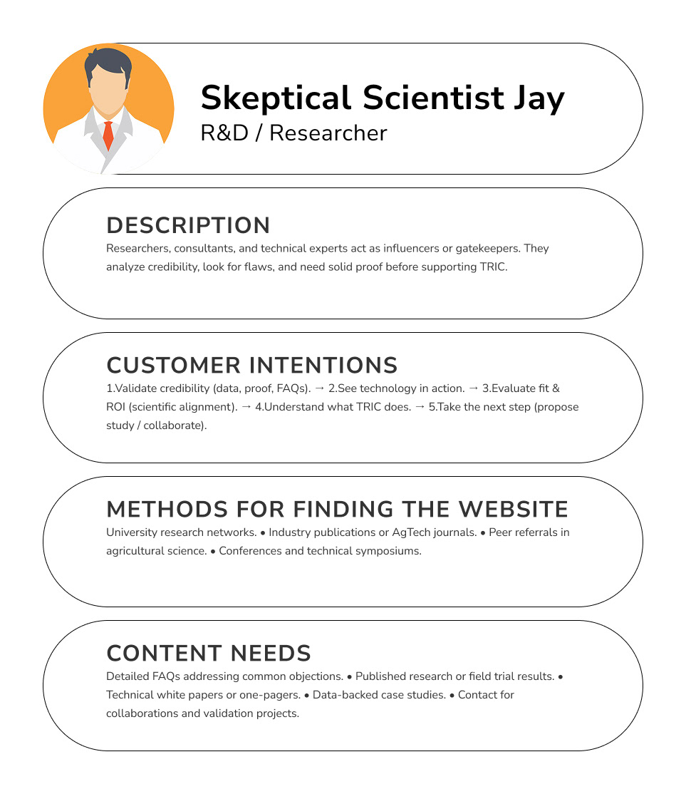
By grounding our design in these user types, we ensured every pathway and piece of content would map to a real-world intention, not just an abstract user journey.
The Core Idea / Early in the project, we distilled TRIC’s complex ecosystem into a simple model. The company’s credibility, their one-of-a-kind technology, and the educational/product proof all need to converge online.
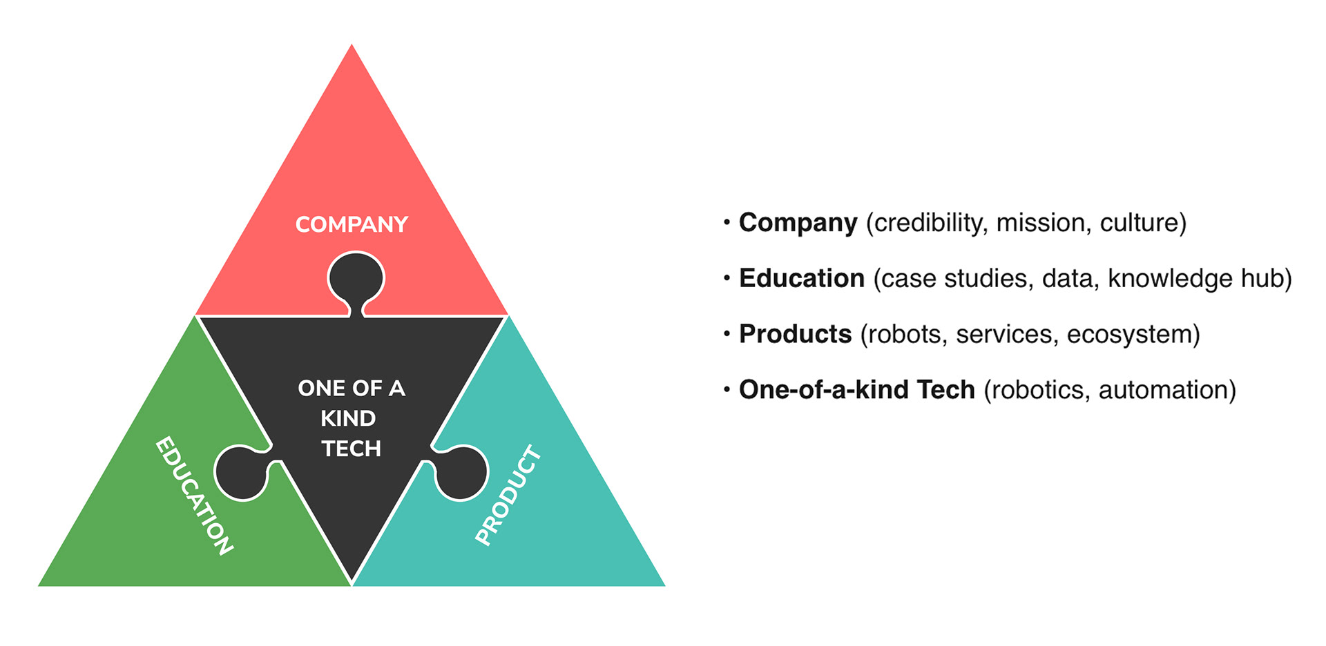
This concept model became our north star. A framework to guide every design decision and ensure the site communicates both trust and innovation.
Customer Intentions / We shifted from thinking only about static personas to focusing on customer intentions, the real reasons someone lands on TRIC’s site and what they want to accomplish.
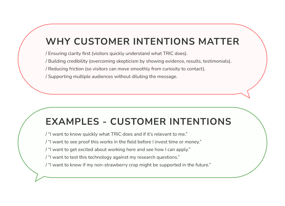
Through stakeholder conversations and research, we ranked these intentions and mapped them directly to design strategies. This ensures every page component has a purpose.

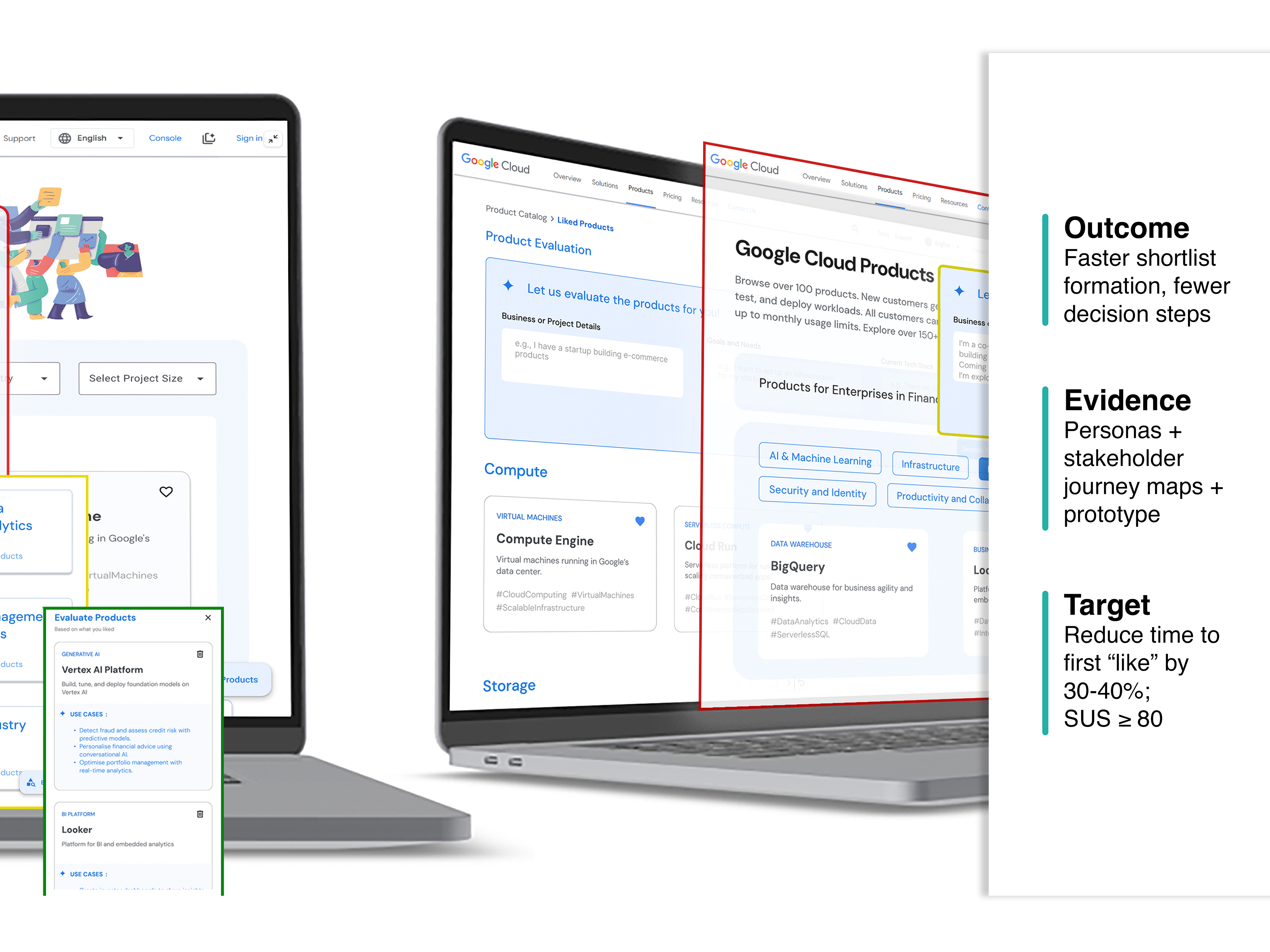
This became our north star as we transitioned into ideation, where we began sketching, prototyping, and validating new ways to make the GCP catalog feel more human and helpful.
Competitive Insights / Competitors showed us two extremes; clarity and proof that builds trust, versus jargon-heavy sites that bury value.
Competitors like Carbon Robotics communicate clarity in a single line. Others bury farmers in data or hide calls to action. TRIC’s site needed to bridge both worlds; showing credibility for R&D and investors, while staying simple and outcome-focused for farmers.
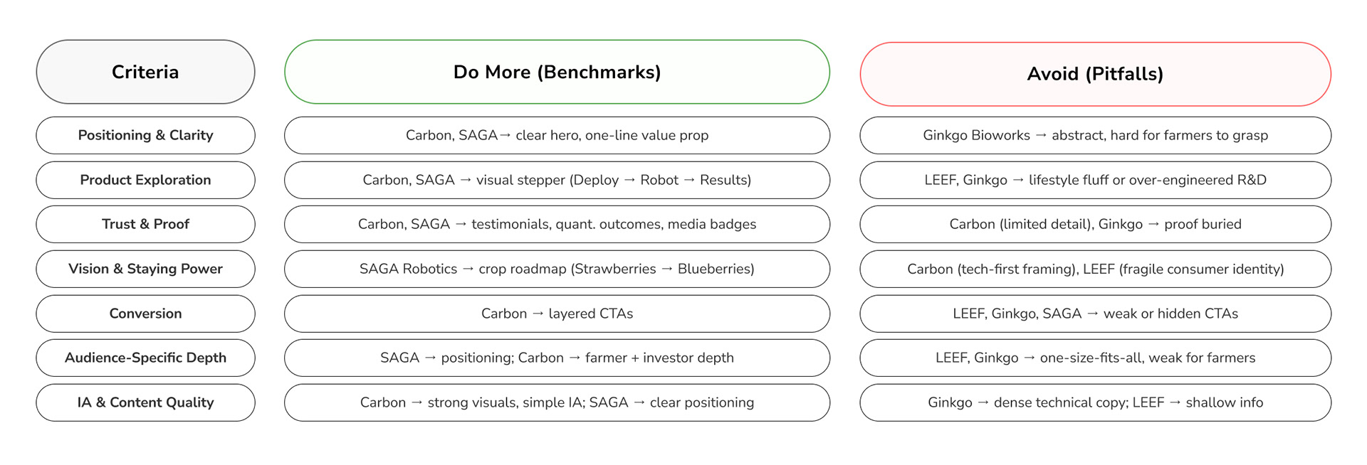
These insights became design guardrails: TRIC’s site must lead with clarity, front-load proof, and provide tailored pathways. By avoiding competitor pitfalls, we set a strong foundation for a farmer-first, credibility-driven redesign.
Content Architecture / Before wireframes, we rebuilt the content foundation; just like in architecture, where planning defines the strength of the structure.
The old IA scattered credibility and confused users. Our new IA aligns intentions, simplifies navigation, and creates clear pathways for every audience.
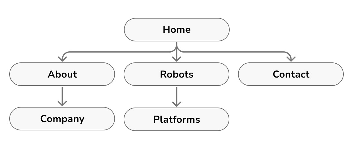
Old Site Map
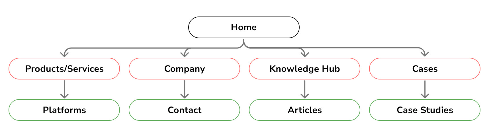
New Site Map
By restructuring TRIC’s content and sitemap, we created a clear, intention-driven foundation that supports every audience and sets the stage for effective design.
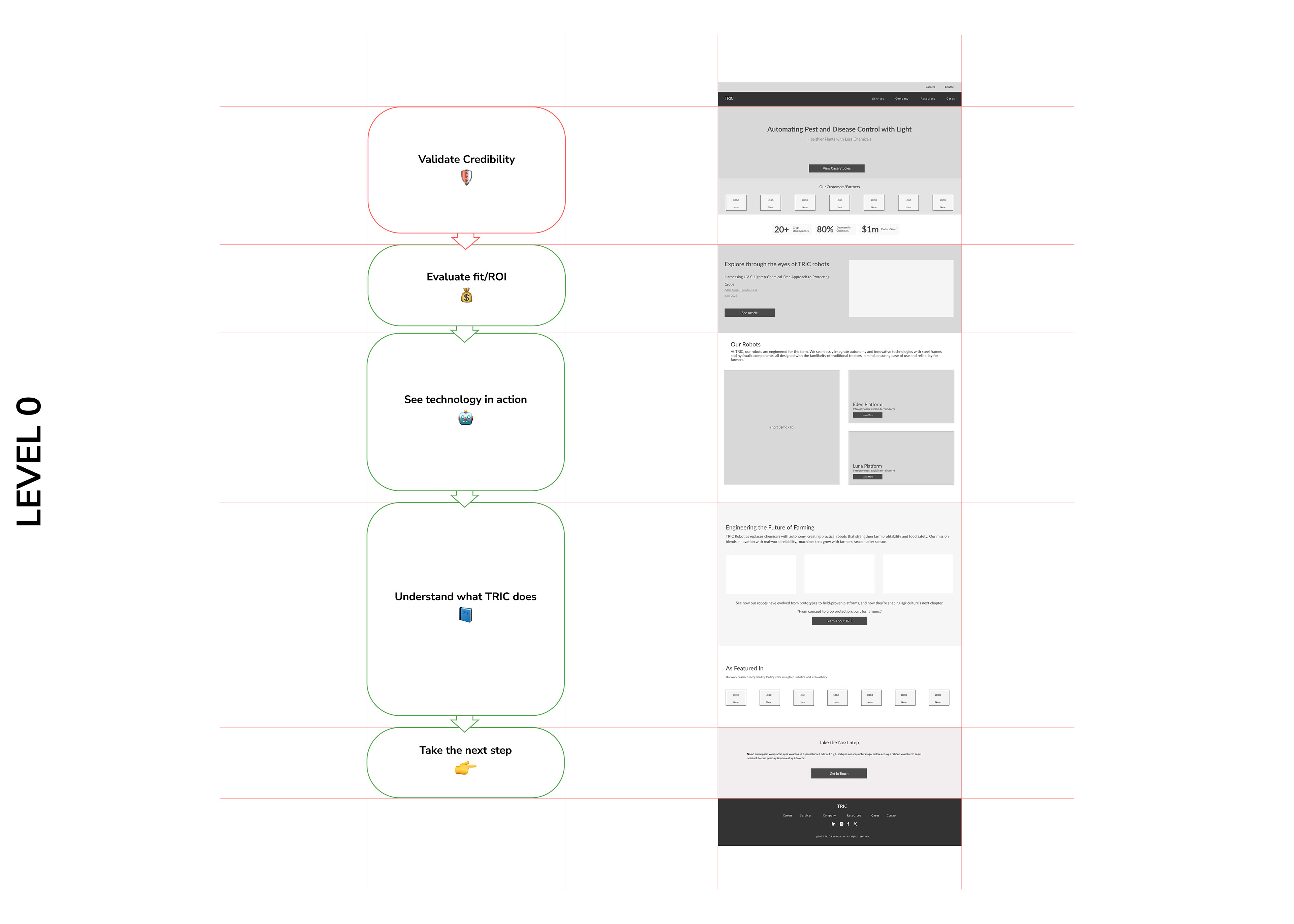
Interaction Models / Validating flows before wireframes
To make sure our architecture worked in practice, we mapped out interaction models. Each flow tied directly to user intentions; showing us whether visitors could quickly validate credibility, see ROI, and take action without friction. This step ensured efficiency before moving into wireframes.
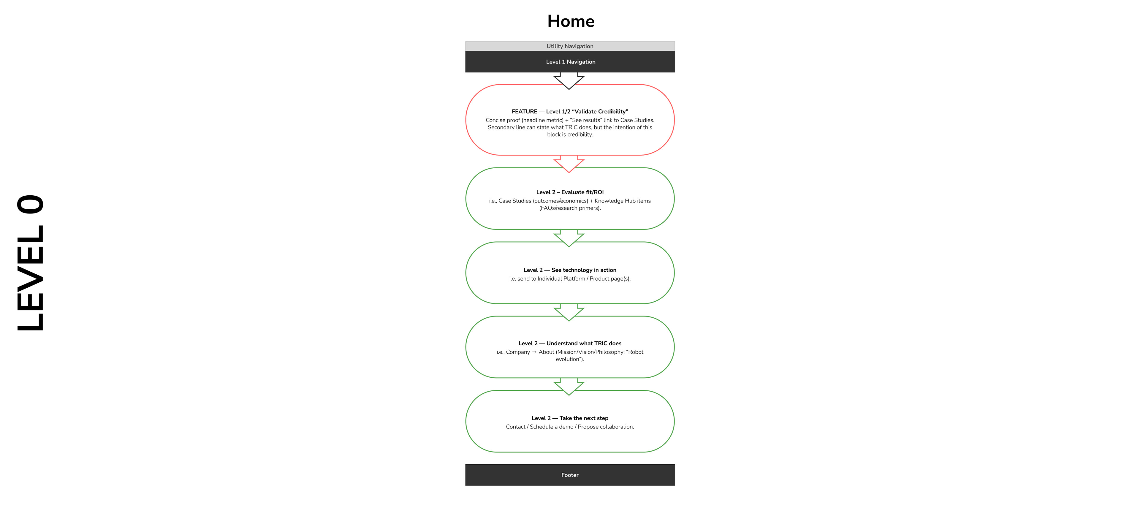
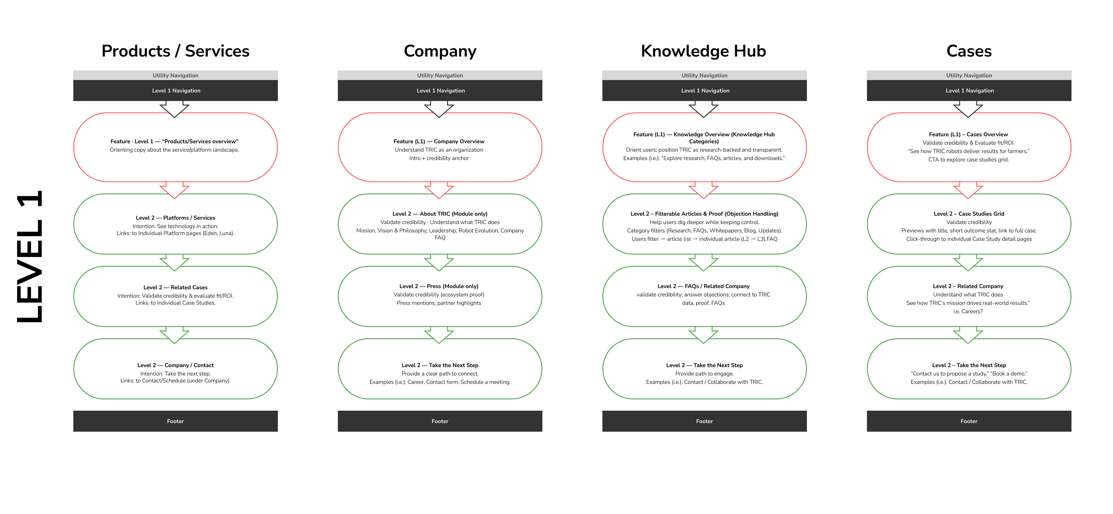
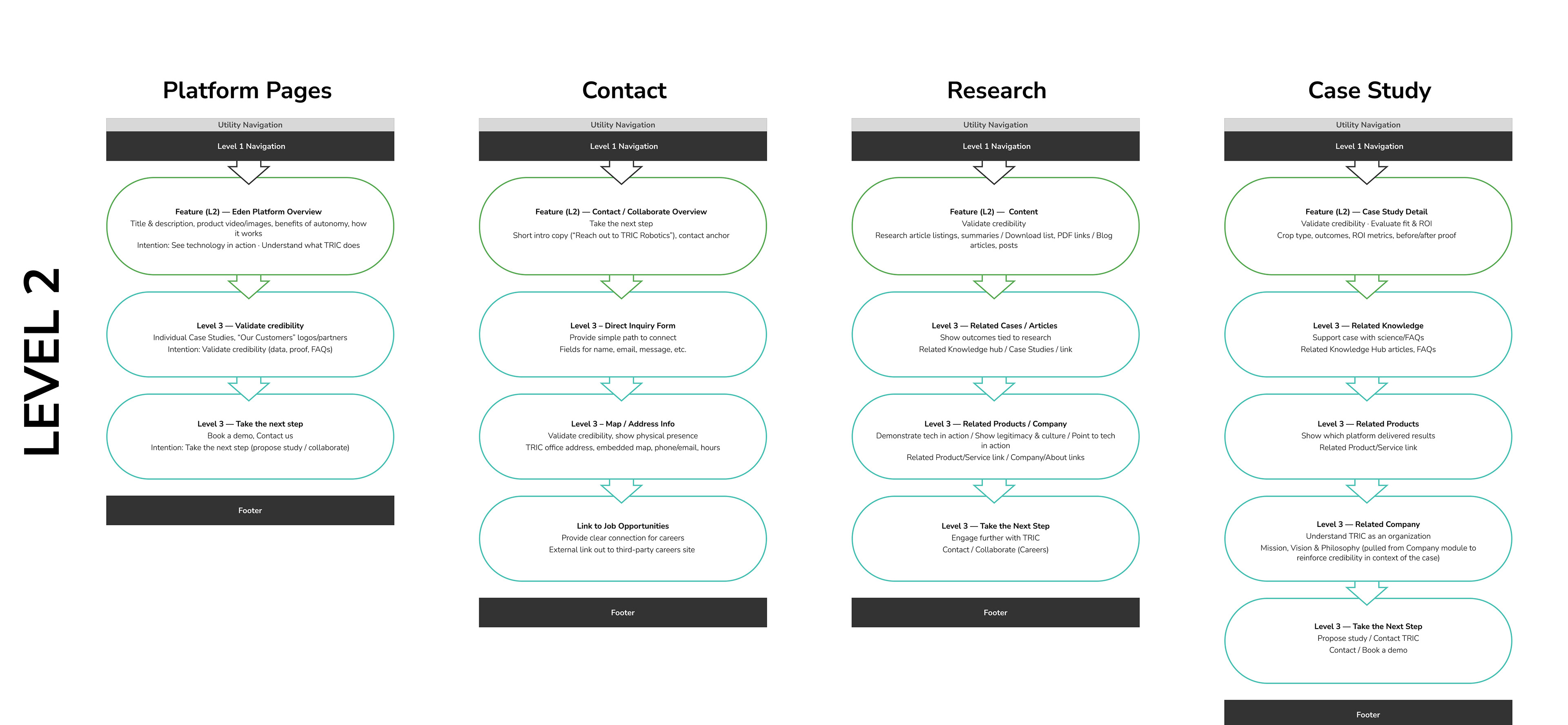
By validating user flows early, we confirmed that every pathway supported intentions and ended in a clear next step.
Content Strategy /
Each page type was designed with a clear purpose, supported by essential content modules, and anchored with a primary call-to-action. This matrix kept us aligned with user intentions and ensured the site flows naturally from credibility to conversion.
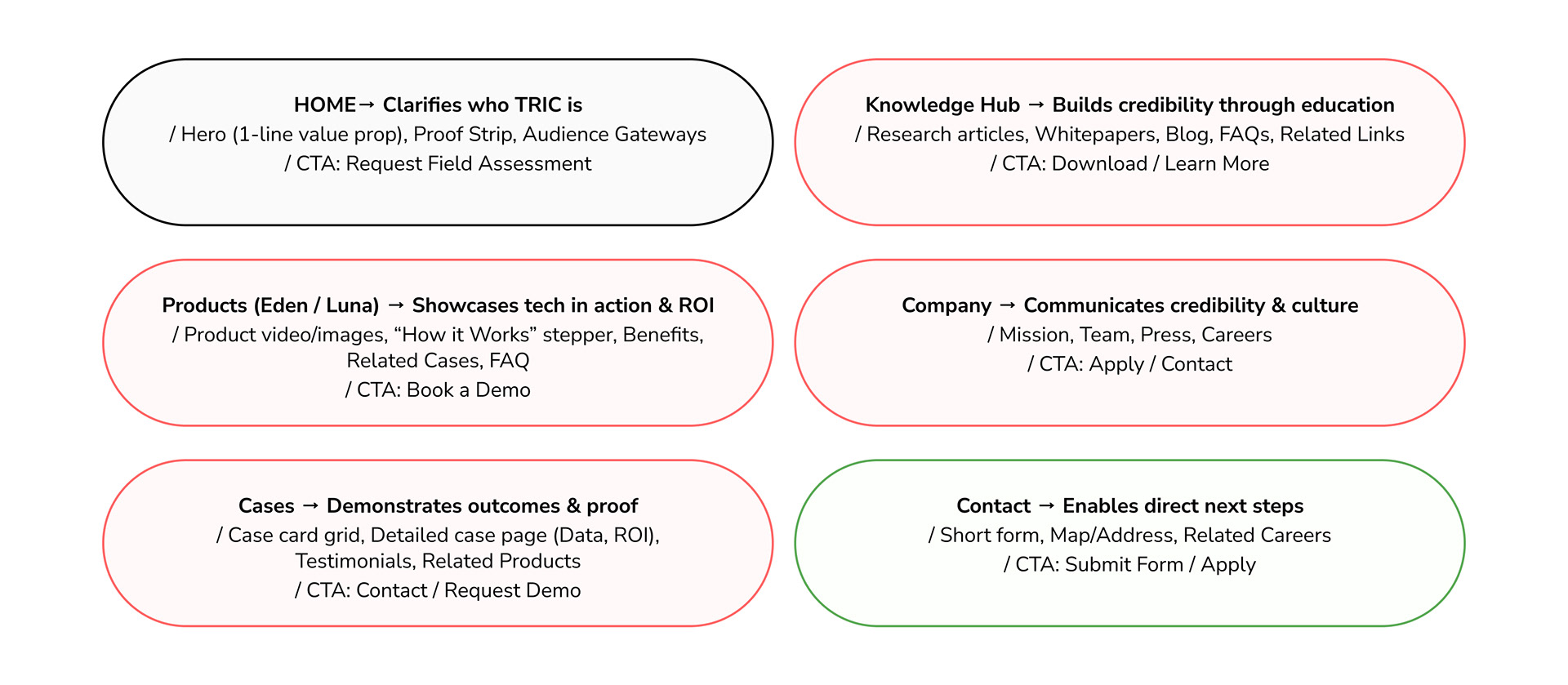
Each page has a job to do (clarify, prove, educate, or convert) and every module and CTA is chosen to make that journey seamless.
Design Principles /
/ Clarity first (RaaS, plain language)
/ Proof early (logos, testimonials above fold)
/ Audience-smart pathways (Farmers, Investors, Talent, R&D)
/ Progressive disclosure (simple first, expand later)
/ Always a next step (contextual CTA every page)
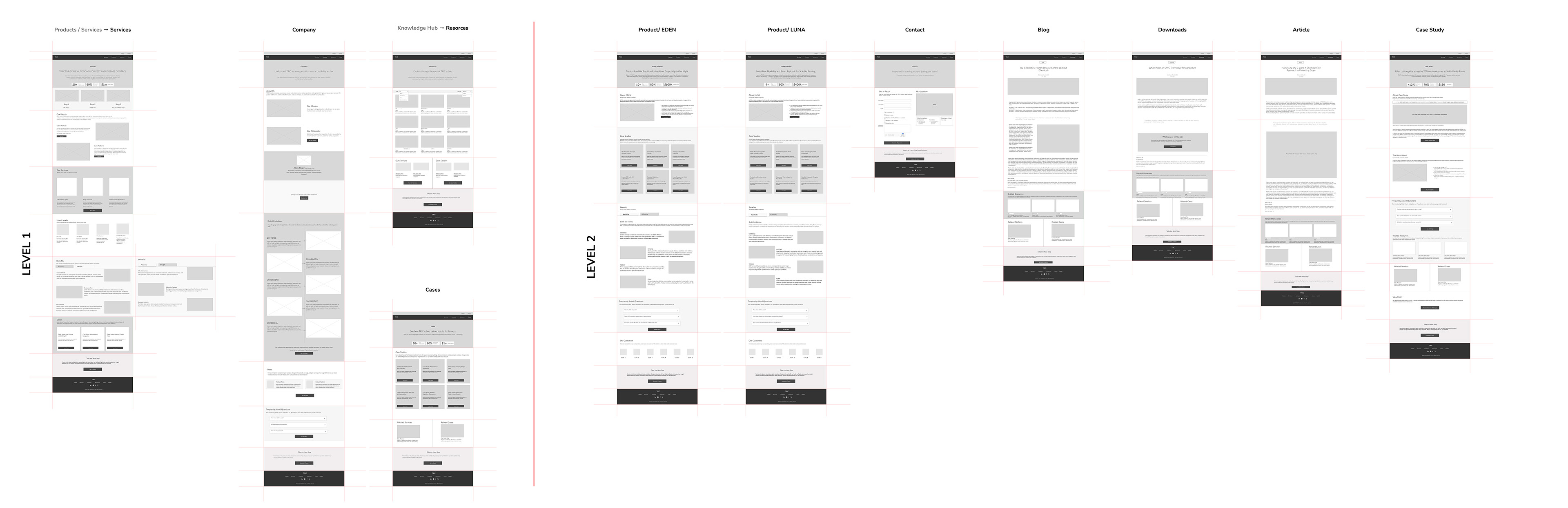
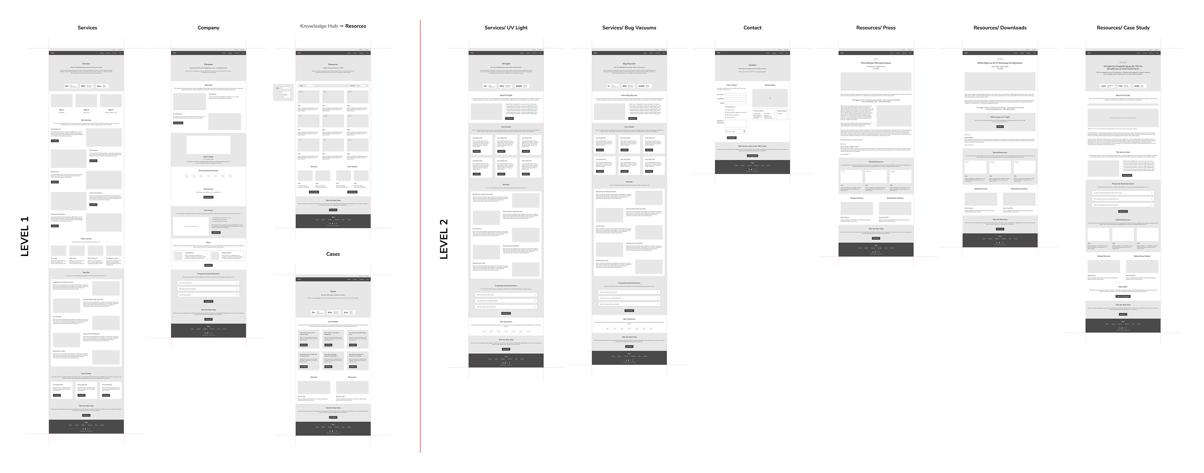
Wireframes / Translating Strategy Into Wireframes.
Every research insight shaped the structure, flow, and calls-to-action.
Wireframes weren’t just a layout exercise, they were the proof that our strategy worked. Each page embodies one or more customer intentions, balances credibility with clarity, and reduces friction in user flows. By grounding every screen in insights, we transformed scattered content into purposeful pathways.
Homepage mapped to intentions: a template we repeated across all pages.
Here’s one example of how we translated customer intentions into design modules: the homepage. Each block directly addresses a key need; credibility, ROI, technology in action, clarity, and next steps.
We applied this same framework across all wireframes (Products, Cases, Company, Resources, and Contact) ensuring every page was purposeful, credible, and conversion-driven.
These wireframes don’t just outline screens, they operationalize intentions.
Each layout is a decision: what builds trust, what shows proof, and what drives conversion.
With this foundation, TRIC is ready for visual design and scalable growth.
Testing & Early Validation / Low-fi concepts were grounded in feedback and insight before scaling.
Objective was to validate navigation logic, clarity of key messages, and hierarchy of calls-to-action with internal team and stakeholders (Adam / John / Lis).
Methods:
/ 3-5 quick usability walkthroughs.
/ Click-through tests in Figma focusing on Discover Products, Company ↔ Product ↔ Education flows.
/ Note-taking grid for friction points, expected vs. actual paths, content clarity.
Findings were :
/ Clearer hierarchy when product tiles grouped by use-case, not robot type.
/ Confusion between “Company Story” and “Technology” pages.
/ Add micro-educational snippets near product specs.
Insights refined the information architecture and guided the next fidelity round.
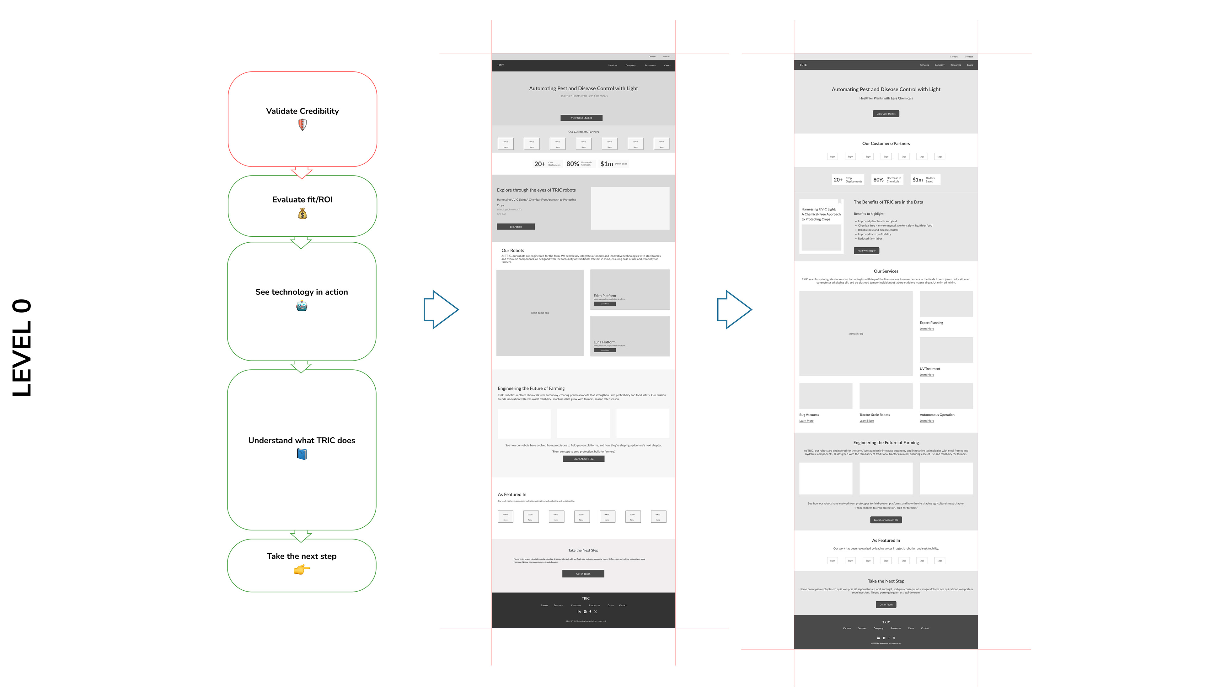
Homepage mapped to intentions and updated after usability testing
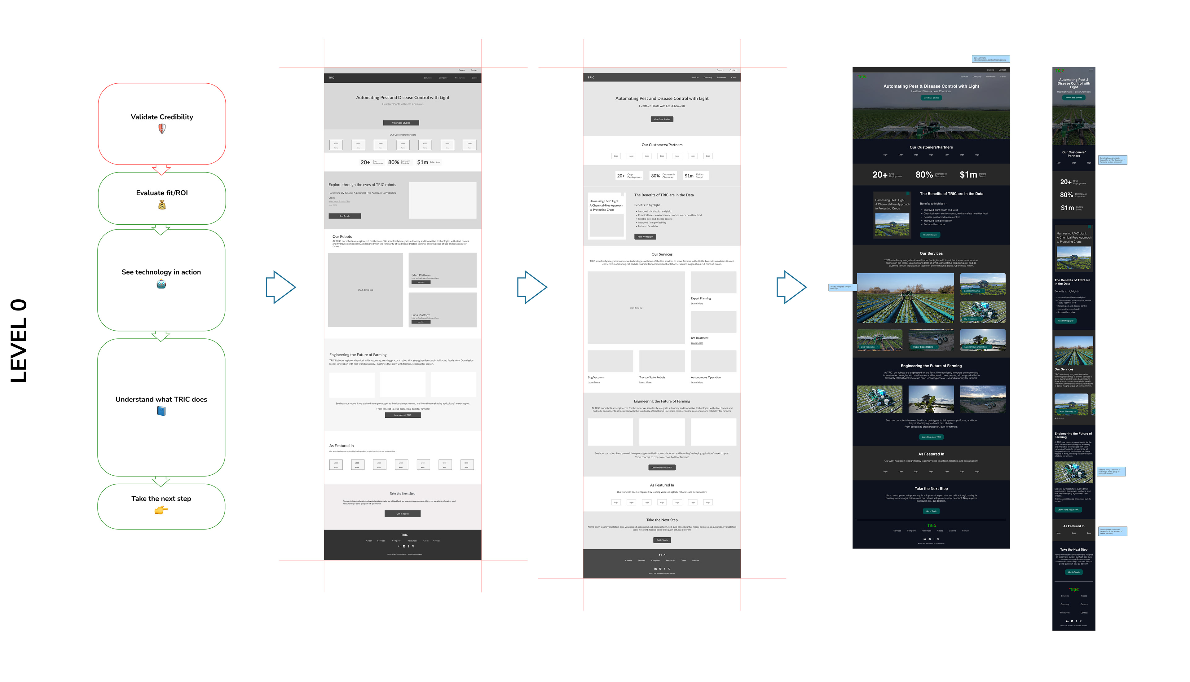
Homepage - Mid-fidelity Prototypes for Web and Mobile Interface
Next Steps /
/ The next phase will focus on translating the validated wireframes into a high-fidelity interface that reflects TRIC’s visual identity, integrating branded colors, product imagery, and subtle motion to enhance engagement.
/ Alongside, the content strategy will be refined to balance scientific precision with an approachable tone, drawing inspiration from NN/g’s editorial clarity.
/ An interactive prototype will be developed in Figma to demonstrate key flows from product discovery to demo request, followed by usability testing with 6–8 participants representing farm-tech and investor audiences to assess clarity and discoverability.
/ The process will conclude with an annotated prototype, updated information architecture, and a developer-ready recommendation sheet.
Team / Sumit Gawali (sbg227@cornell.edu / sumit@cxby.design), Lis Hubert (lis@cxby.design), Vaishnavi Newaskar (vaishnavi@cxby.design)