Google Cloud Platform Discovery Redesign
Making product search, comparison, and selection intuitive for developers.
Making product search, comparison, and selection intuitive for developers.
Role / UX Designer & Researcher working with Google product managers, a content designer, researcher, visual designer, faculty advisor, and stakeholders
Timeline / 4 months
Tools / Figma, Miro, Google Workspace, Notion, Adobe Illustrator
Timeline / 4 months
Tools / Figma, Miro, Google Workspace, Notion, Adobe Illustrator

When I first started exploring the Google Cloud Platform, I quickly realized how overwhelming it could be for technical users, especially developers from smaller companies or those without deep cloud experience. I joined a team focused on rethinking this experience.
Our challenge / To redesign the product catalog page so that users could confidently browse, compare, and choose the right tools, without needing to contact customer support.

We conducted user research, identified key friction points, and translated those insights into a shareable Figma prototype and strategic slide deck. The result was a more intuitive, guided browsing experience tailored for developers with different levels of cloud expertise.
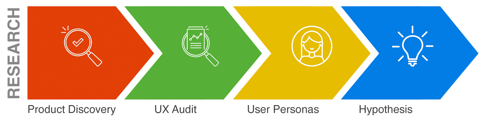
Before jumping into solutions, we wanted to understand how developers actually experience the product catalog on Google Cloud.
What makes browsing difficult? Where do they get stuck? What questions are they trying to answer?
Product Discovery / We started by mapping out the end-to-end product discovery journey on the GCP website. This meant digging into everything from landing pages to pricing calculators, trying to experience the platform as a first-time user would.


What stood out quickly was how the site assumes users already know what they’re looking for.
But for many developers, that’s not the case. They want to explore, compare, and learn, without being overwhelmed or redirected to dense documentation.
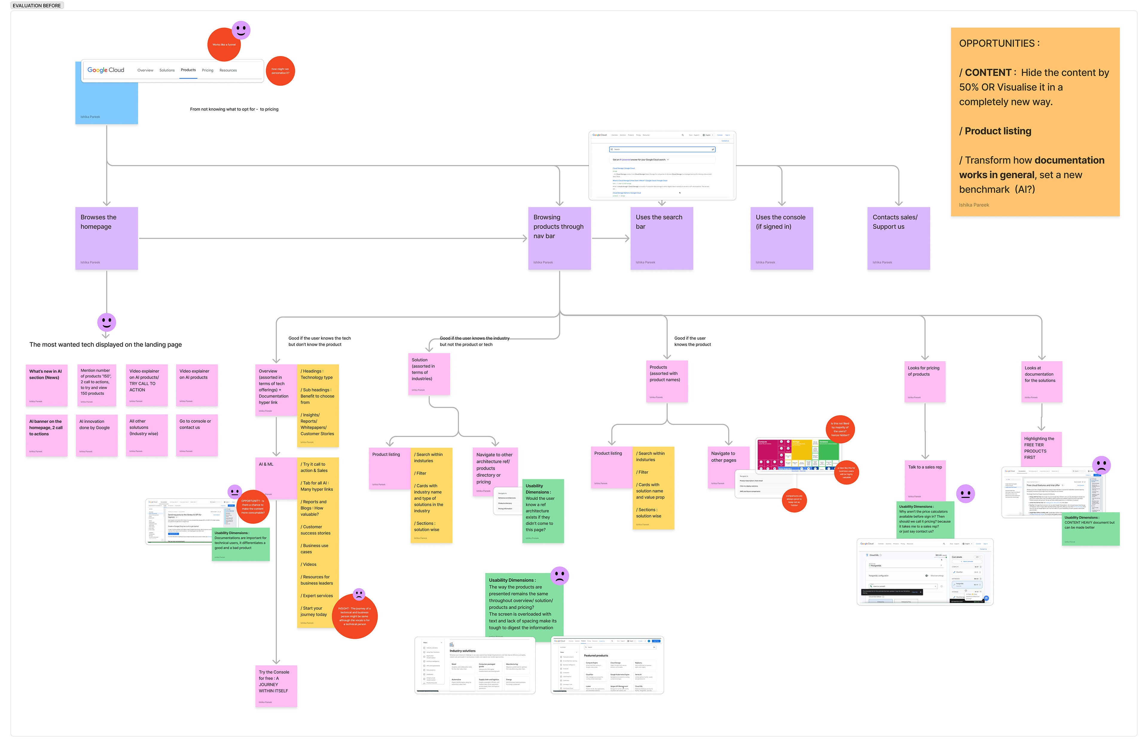

UX Audit / To uncover usability gaps, we ran a detailed UX audit of the product catalog. We evaluated the visual hierarchy, layout, microcopy, and filtering logic using heuristic principles.

We noticed inconsistent labeling, overwhelming dropdowns, and lack of contextual help, especially problematic for low-tech users or developers new to cloud infrastructure.
Even tech-savvy users struggled to find the "right" product without deep prior knowledge.
We also benchmarked GCP against AWS and Azure to see what patterns worked well across platforms.

User Personas / To ground our design in real user needs, we created personas based on stakeholder interviews, developer forums, and competitor research.

These personas helped us empathize with different needs: one wanted guidance and simplicity, the other sought efficiency and technical depth. All needed better ways to browse, compare, and shortlist products without manual workarounds.

Hypothesis / All of this led us to our core design hypothesis:
If we create a more intuitive and personalized product catalog experience, technical users will be able to confidently explore and select products without needing customer support.

This became our north star as we transitioned into ideation, where we began sketching, prototyping, and validating new ways to make the GCP catalog feel more human and helpful.

With research insights in hand, it was time to move into design.
But instead of rushing into wireframes, we wanted to be intentional; starting with mood, inspiration, and a strong narrative arc that could support both exploration and decision-making.
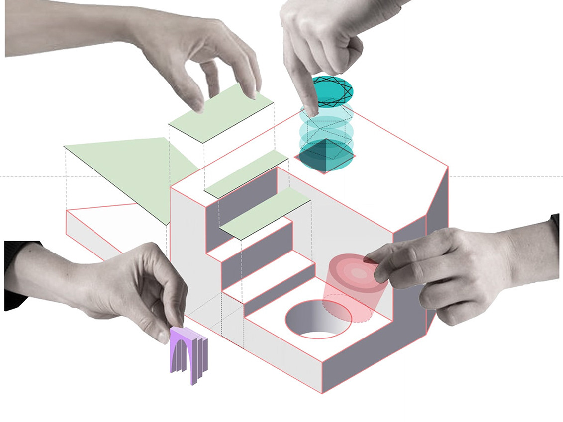
Moodboard / The inspiration leaned on clean layouts, intuitive icons, and minimalistic UI patterns that allow complex information to breathe. We also drew cues from e-commerce platforms (how they structure product discovery and comparisons) with a focus on clarity and control.

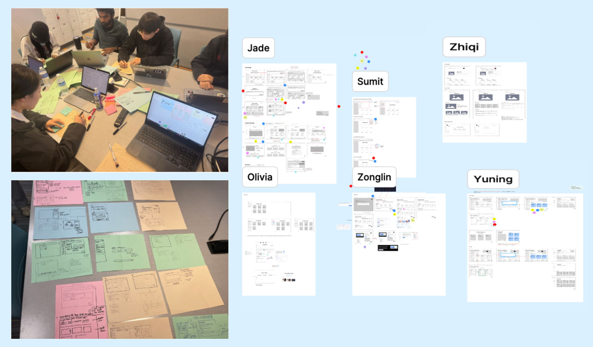
Ideation / we then jumped into low-fidelity sketches to bring early ideas to life.
Some concepts came from direct user pain points:
“I wish I could just shortlist the products I’m interested in.”
“What if I don’t even know what tools I need yet?”
This pushed us to ideate beyond traditional search bars. We explored liked product boards, AI-powered prompts, and even a concept of “starter kits” based on user goals.
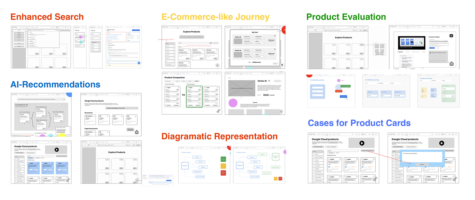
Interactive & AI Journeys / One of the most exciting parts of the design phase was building AI-assisted browsing paths.
We imagined a scenario where users are asked a few simple questions:
“What are you building?”, “What languages do you use?”, “What’s your scale?”
and based on that, the system intelligently suggests relevant tools.


These journeys helped bridge the gap between first-time exploration and informed decision-making, especially for users unfamiliar with GCP's vast ecosystem.
Stakeholder Interviews / To validate our design directions, we interviewed stakeholders from Google Cloud’s marketing and UX writing teams.


They emphasized the need for transparency, especially around pricing, and highlighted opportunities to surface contextual support earlier in the journey. These conversations reinforced our direction and helped us align our tone, flow, and prioritization with real-world expectations.
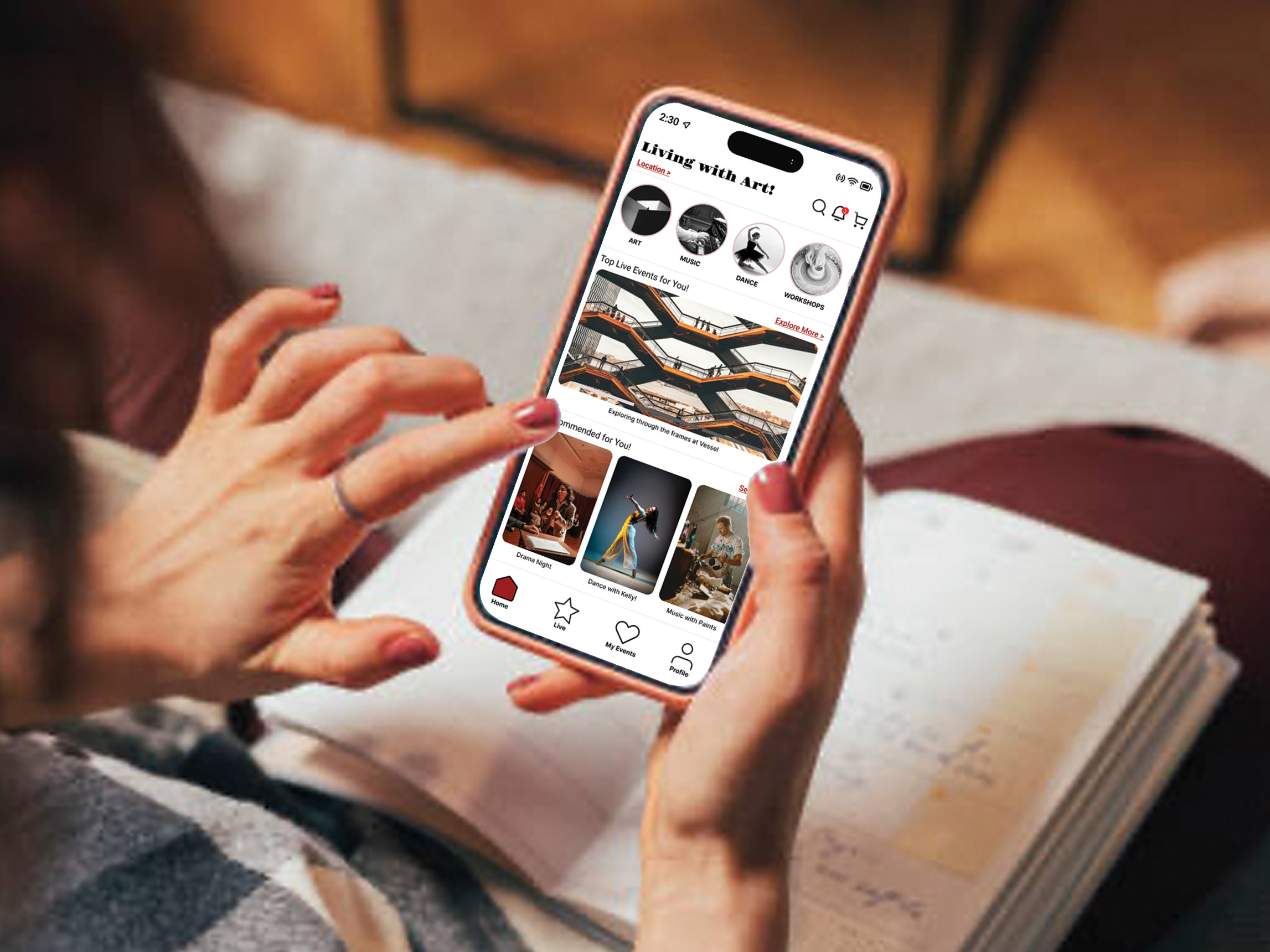
Final Journeys / In the end, we stitched everything together into a streamlined prototype.
The new product discovery flow included:
A “Liked Products” dashboard where users could save and compare tools
An AI-driven prompt interface to suggest starting points
These final journeys aimed to meet users where they are; whether they’re browsing casually, or deep in evaluation mode.


Key Insights / Across our research and design journey, a few insights stood out, and they consistently shaped our decisions:
Users don’t want to browse cloud products the way they shop for groceries.
They need context, use cases, and clear signals that a product is the “right fit” for their goal.
They need context, use cases, and clear signals that a product is the “right fit” for their goal.
Search isn’t enough, exploration is a different mindset.
While GCP has a powerful search function, many users don’t know exactly what to search for. We needed to design for discovery, not just retrieval.
While GCP has a powerful search function, many users don’t know exactly what to search for. We needed to design for discovery, not just retrieval.
There’s no such thing as one technical user.
From freelance builders to experienced engineers, expectations and needs vary wildly. Personalization and flexibility became core principles.
From freelance builders to experienced engineers, expectations and needs vary wildly. Personalization and flexibility became core principles.
Users want autonomy, but not isolation.
A common tension we found was that users want to figure things out on their own, but still appreciate small nudges, examples, or scaffolding when stuck.
A common tension we found was that users want to figure things out on their own, but still appreciate small nudges, examples, or scaffolding when stuck.
Conclusion & Reflection / This project pushed me to think beyond traditional UX flows and consider how intelligent guidance, visual clarity, and human-centered structure can transform complex ecosystems like cloud platforms.
I came into this project wanting to make GCP easier to navigate, but walked away with a deeper understanding of how users make decisions under uncertainty and how thoughtful design can reduce friction at every step of the journey.
If I had more time, I’d love to test this prototype with real GCP users and iterate based on their reactions. I also see potential in integrating live usage data to further personalize product suggestions and build trust.
"The project helped me realize that good UX goes beyond usability, it empowers people to explore, even in complex systems."
Team / Sumit Gawali (sbg227@cornell.edu), Ishika Pareek (ip249@cornell.edu), Jade Wang (qw298@cornell.edu), Zonglin Zuo (zz874@cornell.edu), Olivia Wei (sw2392@cornell.edu), Yuning Wang (yw2675@cornell.edu), and Zhiqi Chen (zc538@cornell.edu)